Best Fonts for Team Jerseys & T-Shirts: The Ultimate Guide
May 3, 2026 · 13 min read
A bad font choice can ruin an otherwise great jersey. You've seen it — a team shows up with lettering so thin it's unreadable from the bleachers, or so over-designed it looks like a Halloween costume. Font selection isn't just a design preference. It's a functional decision that directly affects how your team is perceived, recognized, and remembered.
Whether you're outfitting a rec league basketball squad, a school baseball team, or a tournament fan crew, this guide breaks down everything you need to know about sports jersey fonts — from the principles behind great athletic typography to specific font names worth using. Coaches, players, and fans alike make these decisions every season. Getting it right the first time saves money, frustration, and a lot of regret at the first game.
Why Font Choice Makes or Breaks a Jersey
Think about the last time you watched a game from the stands. Could you read the player's name from row 15? Did the number on the back match the lettering style on the front? These details matter more than most people realize.
Great sports uniform fonts do three things well:
- They're legible at a distance. Bold strokes and tight letterforms survive the visual chaos of motion and lighting.
- They communicate team identity. A sharp, aggressive font says something completely different than a clean, modern one.
- They scale without falling apart. A font that looks great at 72pt needs to hold up at 144pt on a back panel.
Thin serifs and decorative scripts fail on jerseys almost every time. The fabric printing process — whether sublimation printing, heat-transfer lettering, or embroidery — punishes delicate letterforms. What looks crisp on a screen turns muddy on mesh.
Pro insight: Always test your chosen font at the actual print size before finalizing. What looks perfect on a laptop screen can lose critical detail once it's pressed onto polyester.
What to Look for in a Sports Font
Before diving into specific picks, let's talk principles. Font selection for sports teams comes down to four core factors:
Stroke Weight and Boldness
Heavier fonts survive the printing process better. Bold font names like Bank Gothic Medium or Cooper Black hold their shape across fabric types — from cotton tees to moisture-wicking jerseys. Lightweight fonts blur, especially on darker fabrics.
Number Compatibility
Your jersey name font needs to work with your numbers. Mismatched styles — a sleek modern name with an ornate number — create visual inconsistency. Font pairing matters here as much as individual font quality. Always test the full alphanumeric set before committing.
Readability in Motion
Visibility in motion is a real design challenge. Kerning and letter spacing affect how legible a name reads when a player is running. Tight kerning on condensed fonts can cause letters to merge visually at speed. Open spacing helps — but too much and it looks sloppy.
Customization Flexibility
Can you condense it? Extend it? Add an outline or a drop shadow? The best jersey typefaces offer enough flexibility to adapt across different apparel types — jerseys, t-shirts, jackets, hats, and even face masks. Color and font coordination matter, too. A font that works in white on navy won't always translate cleanly to gold on black.
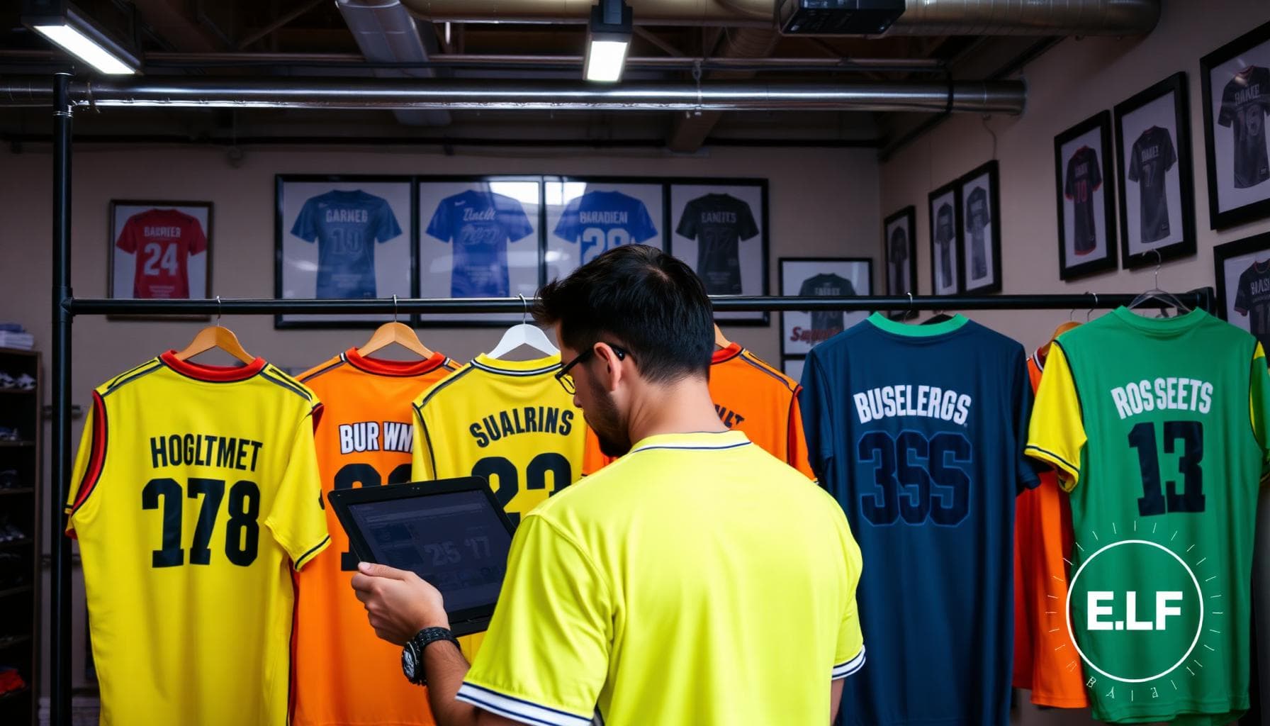
Best Fonts for Team Jerseys & T-Shirts
Here's where it gets practical. These fonts consistently perform across custom jerseys, printed sports apparel, and personalized team shirts. They're organized by style category so you can match them to your team's identity.
Bold and Athletic Fonts
These are workhorses — built for basketball jersey fonts, football uniforms, and any sport where raw power is the vibe.
- Aachen Bold — thick slab serifs with serious visual weight. It reads confidently from the upper deck and holds up beautifully across a range of uniform fonts.
- Bank Gothic Medium — a geometric sans-serif that feels futuristic without being flashy. Hugely popular as an NFL team font style and a consistent go-to for esports team branding.
- Eames Bold — structured, precise, and surprisingly versatile. It brings an architectural quality to athletic uniform design that works especially well on modern kits.
- United Bold 2 — a tight, condensed option that packs maximum punch into minimal horizontal space. Ideal for longer names on narrow jersey backs.
- Eurostile Roman — clean, slightly rounded corners with a modern edge. Works beautifully for soccer jersey fonts and running club apparel.
| Font | Best For | Style Tag |
|---|---|---|
| Aachen Bold | Football, Rugby | Slab Serif |
| Bank Gothic Medium | Basketball, Esports | Geometric Sans |
| Eames Bold | Modern Kits, Soccer | Structured Sans |
| United Bold 2 | All Sports | Condensed Bold |
| Eurostile Roman | Soccer, Running | Clean Sans |
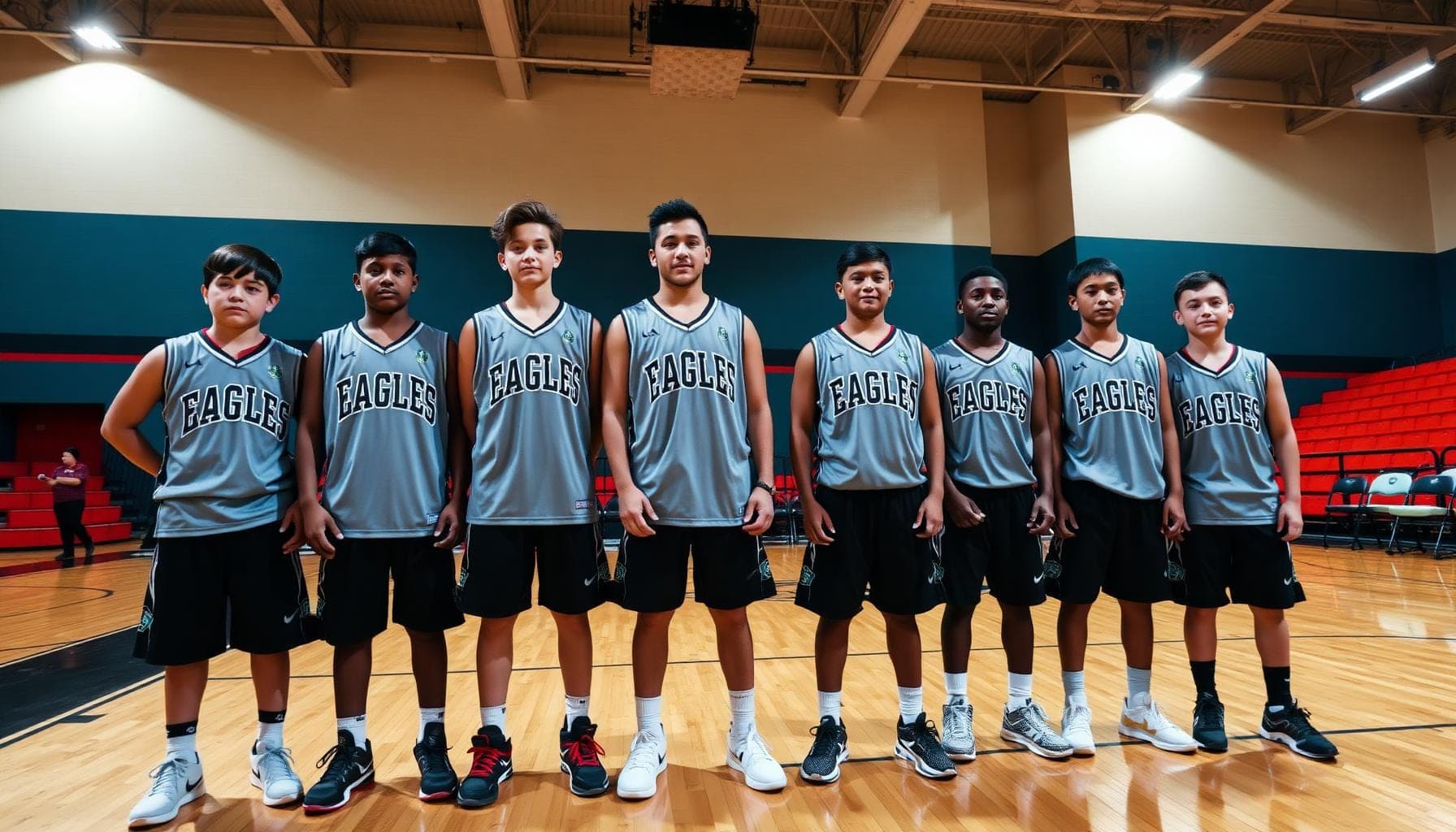
Classic and Collegiate Fonts
These fonts carry nostalgia. They work especially well for baseball uniform fonts, school sports uniforms, and varsity font style applications.
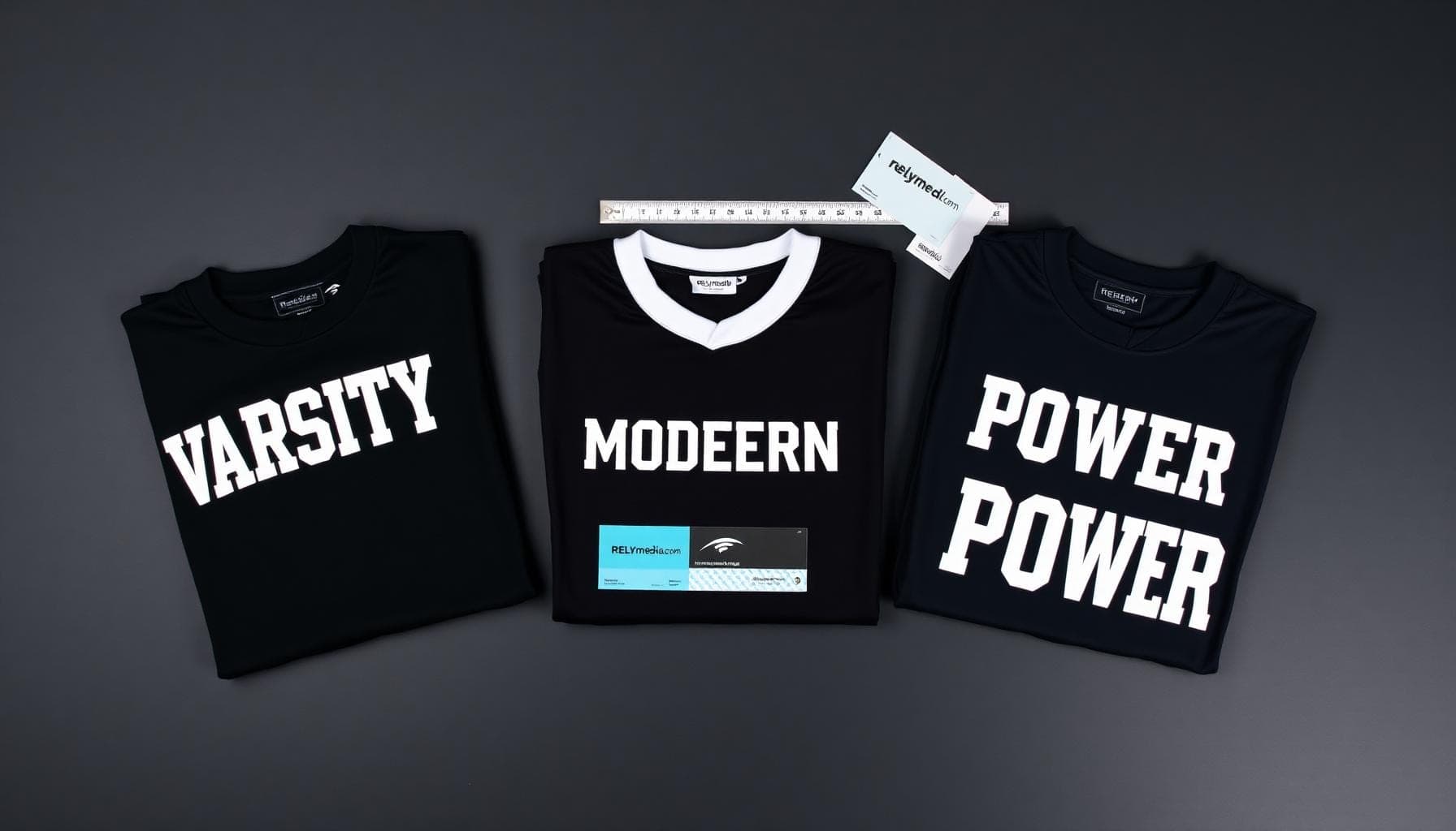
- Varsity — the gold standard of collegiate typography. Block letters, arched placement, immediate recognition. Every school team has worn this at some point. It's the definitive jersey typeface for traditional athletic branding.
- College A / College B — slightly softer than Varsity but equally authoritative. Perfect for intramural team shirts and rec league apparel where a classic look still matters.
- Cooper Black — round, friendly, and unmistakably bold. It punches above its weight on custom t-shirt lettering and fan merchandise.
- All-American Bold — exactly what it sounds like. Patriotic, strong, and designed specifically for athletic uniform design.
Design tip: Pair Varsity with a clean sans-serif for numbers. The contrast works — the serif carries tradition while the modern number brings balance. That's smart font pairing in action.
Aggressive and Sharp Fonts
Need something with an edge? These jersey letter fonts communicate intensity without sacrificing readability.
- Blade Runner — angular cuts and sharp terminals. Made for MMA kits, esports squads, and anyone who wants their team uniform typography to feel dangerous.
- United Ext Stencil — military-influenced, tough, and incredibly versatile across custom sports gear design projects. A strong choice when stencil fonts for sports are the right call.
- Bullet Small — compact and punchy. Works well as a supporting font for secondary text on jerseys and team t-shirts.
- Eveleth Eroded / Eveleth Solid — distressed texture with high-impact presence. The eroded version adds a worn, battle-tested character to athletic branding fonts that nothing else quite replicates.
Clean and Modern Fonts
Sometimes less is more. These sports jersey fonts strip away the noise and let the team identity speak for itself.
- Neutra Slab Bold — architectural precision with a slab serif finish. Elevated without being pretentious. Great for modern custom apparel typography and team identity design.
- Bourton Base — geometric, clean, and surprisingly versatile. Works across jerseys and team merchandise design alike.
- Flyer Fonts Straight / Flyer Fonts Black — utilitarian boldness that reads well at scale. A reliable choice when you want legible jersey fonts without any decorative distractions.
Retro and Vintage Fonts
Throwback kits are everywhere right now. These fonts nail that heritage aesthetic perfectly.
- ITC Motter Corpus — rounded, retro-flavored lettering with unmistakable personality. Looks right at home on a 1970s-inspired baseball team design.
- Local Brewery Regular — quirky and rustic. Surprisingly effective for intramural team shirts and casual fan apparel where character matters more than formality.
- Veneer Eroded / Veneer Solid — distressed vintage texture. Pairs beautifully with muted color schemes for one-of-a-kind uniform design.
- Thirsty Script — the one script font that actually works on apparel. Bold enough to survive the print process, distinctive enough to stand out among handwritten sports fonts.
- Taberna Serif Black — heavy, commanding, and rooted in classic typographic tradition. A strong choice for team name fonts on heritage-style kits.
Decorative and Greek Fonts
Not every team wants a conventional look. Decorative fonts and Greek fonts serve a specific but important niche — particularly for fraternities, sororities, cultural sports teams, and organizations that want their typographic identity to reflect heritage or community.
Greek-style letterforms work exceptionally well on custom t-shirt designs for Greek life athletic events, intramural competitions, and cultural tournaments. The key is pairing them with a clean secondary font so the overall design stays readable and visually consistent.
Bring Your Font Choice to Life on Custom Jerseys
RELYmedia's Design Lab gives you hands-on control over font selection, color, and layout — built for real teams with real deadlines.
Font Categories Worth Knowing
Understanding broad font categories helps you make faster, smarter decisions. Here's a quick reference:
| Category | Characteristics | Best Use Case |
|---|---|---|
| Serif fonts | Small strokes at letter ends | Classic, traditional jerseys |
| Sans-serif fonts | Clean, no strokes | Modern, minimalist kits |
| Script fonts | Flowing, cursive style | Casual tees, fan apparel |
| Handwritten fonts | Organic, informal feel | Rec leagues, custom merch |
| Greek fonts | Symbol-based letterforms | Cultural teams, Greek life |
| Decorative fonts | Highly stylized | Statement pieces, fan shirts |
How to Pair Fonts on a Jersey
Font combinations for apparel follow a simple rule: contrast without chaos. One font does the heavy lifting. The second supports it without competing.
Here's what works:
- Bold collegiate + clean sans-serif numbers — classic pairing, instant visual hierarchy
- Aggressive stencil + minimal block numerals — tough and cohesive
- Vintage script name + solid block numbers — character-forward without sacrificing readability
What doesn't work:
- Two decorative fonts fighting for attention
- Mismatched weights — ultra-thin name paired with an ultra-heavy number
- Script fonts on both name and number — unreadable in motion
Typography hierarchy matters on jerseys. The team name or player name is primary. Numbers are secondary. Any additional text — year, mascot, motto — is tertiary and should be noticeably smaller. Think of it as a visual pecking order. The eye lands on the most important element first, then moves naturally through the design. Font weight and readability drive that journey.
Coaches often overlook this. A coach font decision — the text printed on staff jackets or sideline gear — should mirror the team's primary font. Visual consistency across all apparel builds a stronger, more cohesive team appearance.
Fonts to Avoid on Jerseys
Just as important as knowing what works is knowing what to skip entirely.
Avoid these on athletic apparel:
- Thin serif fonts — they disappear on fabric, especially at a distance
- Casual handwritten fonts — charming on paper, illegible on a moving player
- Overly decorative display fonts — great for posters, terrible for jerseys
- All-lowercase scripts — uppercase styling matters here; all-lowercase reads as unclear on uniforms
The core issue is always the clarity of the fabric print. A font that looks elegant on screen can completely collapse once it hits a heat press or is subjected to sublimation printing. Durable typography design means choosing fonts with enough visual mass to survive the process intact.
Free vs. Premium Fonts — What's Worth It?
Here's the honest take. Free fonts can work — but they come with real trade-offs.
| Factor | Free Fonts | Premium Fonts |
|---|---|---|
| Commercial licensing | Often restricted | Usually included |
| Character set completeness | Sometimes incomplete | Full alphanumeric |
| Print optimization | Inconsistent | Typically better |
| Customization options | Limited | More weights and widths |
| Support and updates | None | Usually available |
For custom jerseys and personalized team shirts you plan to sell or distribute, always verify the commercial license first. Premium fonts designed specifically for athletic logos and uniform use are worth the investment when the stakes are real.
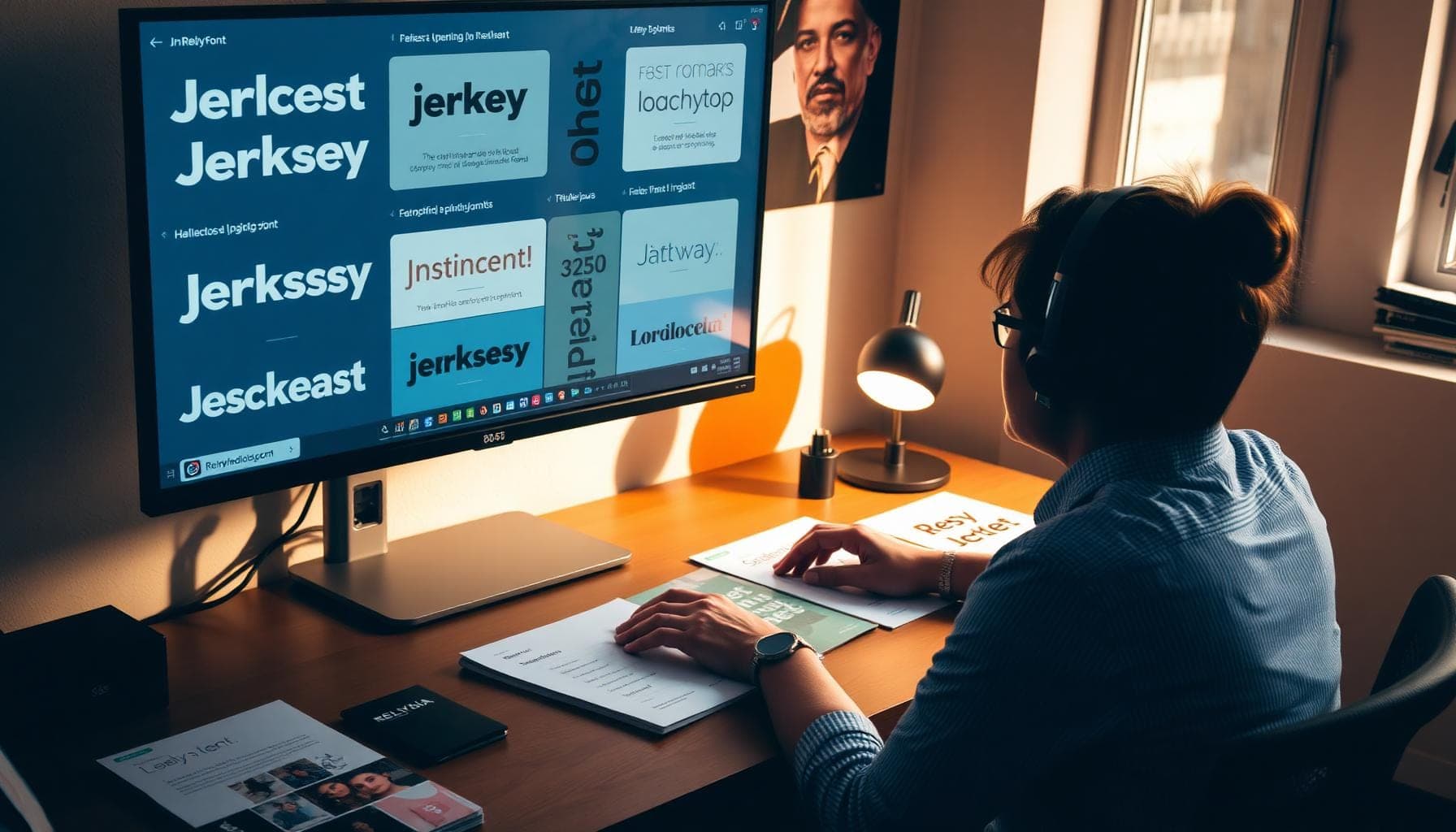
How to Test a Font Before You Print
Before committing to a full production run, work through these steps:
- Print a physical test at actual jersey size — not just a screen preview
- Check number compatibility — print the full 0–9 set alongside the team name
- Test on the actual fabric color — dark backgrounds behave differently from light ones
- View from 10–15 feet away — simulate real viewing distance from the stands
- Check motion readability — photograph someone wearing the test print while moving
Catching a problem at the sample stage costs almost nothing. Catching it after a full production run is expensive, time-consuming, and completely avoidable.
Design Your Own Jersey with RELYmedia
Choosing the right jersey font is step one. You still need a partner who executes your vision cleanly, quickly, and at scale.
RELYmedia makes that part easy. Based in Eagan, Minnesota, they specialize in custom sports apparel — jerseys, t-shirts, jackets, hats, and more — with turnaround times that actually hold up under pressure. Their Design Lab serves as a full-custom apparel design lab and sports template generator, giving you hands-on control over font selection, color coordination, and layout — all within a platform built for real teams with real deadlines.
Whether you're building custom sports gear for a rec league, outfitting a school basketball team, or creating team merchandise for a tournament, RELYmedia brings the expertise and quality assurance to get it right the first time. Hundreds of five-star reviews back that up.
Ready to build your team's look? Use RELYmedia's Design Lab to create custom jerseys that get noticed — start your order today.
Don't Leave Your Team's Identity to Chance
From font selection to layout to delivery, RELYmedia delivers fast, reliable custom jerseys built around your team's needs.
Ready to print your team's name on premium apparel?
Fill in your details and a RELYmedia specialist will come back to you with a custom quote — fast turnaround, no obligation.
- ⚡Same-day response on business days
- 🎨Free design assistance included
- 🚚Rush order & fast delivery available
- 💰Price beat guarantee on every order
Conclusion
The right jersey font does more than look good. It communicates who your team is before a single play happens. From bold athletic choices like Aachen Bold, Eames Bold, and Bank Gothic Medium to vintage classics like Varsity and ITC Motter Corpus, the options run deep. But the principles stay simple — prioritize readability from distance, nail your font pairing, test before you print, and maintain visual consistency across every piece of apparel your team wears.
Sports branding starts with typography. And typography starts with intentional choices — not defaults.
When you're ready to bring those choices to life, RELYmedia delivers. Fast, reliable, and built entirely around your team's needs.
Don't leave your team's identity to chance. Get started with RELYmedia today and design custom jerseys your whole squad will be proud to wear.
Our Customer Feedback


Mike Larson
Unbelievable Turn-around
We are stunned with how quickly we received our order. It turned out perfect, and all of our interactions with staff have been fantastic. Thank you so much!
Jana
Great customer service and on-time delivery with product as advertised!
The product arrived exactly as advertised and on time. This company was very easy to work with, and the price was great!
Sarah
Quick Turn-Around and Immediate Communisaton
I've ordered a couple times from RELY. My initial order was not time sensitive so we had time to get it correct. We went back and forth with proofs until I felt comfortable. When I had a question, the sales team was very responsive. When it came to my re-order, I needed it fast. They responded and got it to me right on time.
Rob
Fabulous experience, great suggestions from the staff!
The sales staff had great suggestions and were very helpful in the process to, in the end, get exactly what was necessary for our use!
Emily
Great service!
Everything went well as anticipated, and as planned. Service was superb & shipment was expedited in a speedy fashion! Thank you for your service!
Freddy
Thumbdrives
2nd time I have ordered from these guys and they have a good product for the price. The delivery time was as said with no troubles. Would recommend and will be reordering again.
Patty
This is a top notch company. Awesome as what they do. Highly recommend.
If you are looking for a company that says what they do and then do what they say - RELYmedia is for you!!! We have done a couple critical orders with RELYmedia and they were ahead of schedule and the items were perfect. We will be utilizing their talents again!!!
Blanca
Very responsive,
All my inquiries were handled in a very timely fashion. My contact was courteous and helpful. Items ordered were received very quickly. Thanks for the superior service!
Andrew
Overall great experience.
They are friendly and knowledgeable. They are well priced, and ship fast.
Trusted By